Your sign is the first handshake. Long before a customer walks through your door, your signage has already introduced your brand. It’s a silent ambassador, working 24/7. In a world saturated with visual noise, a flat, forgettable sign simply blends into the background. It doesn’t do your business justice.
So, how do you make a statement that literally stands out? The answer is dimensional letters. This is more than just a sign; it’s an architectural element that adds depth, sophistication, and a sense of permanence to your brand’s identity. It tells the world you’re here to stay.
This guide is your complete roadmap to the world of 3D signage. We’ve distilled decades of industry expertise to walk you through every critical step. Whether you’re a business owner wanting to elevate your storefront, an architect planning a new commercial facility, or a designer seeking the perfect branding solution, you’ll find everything you need right here. We’ll cover it all—from choosing the perfect material to understanding the intricacies of installation and care.
Table of Contents
The Fundamentals of Dimensional Signage
What Are Dimensional Letters? A Deep Dive into 3D Signage
Defining the Core Concept
At its heart, dimensional letter is beautifully simple. These are individual, solid characters or logo elements that project outward from the surface they are mounted on. Unlike a flat vinyl decal or a printed panel, they have physical depth—a third dimension that gives them substance and presence. Think of it as the difference between a photograph of a sculpture and the sculpture itself.
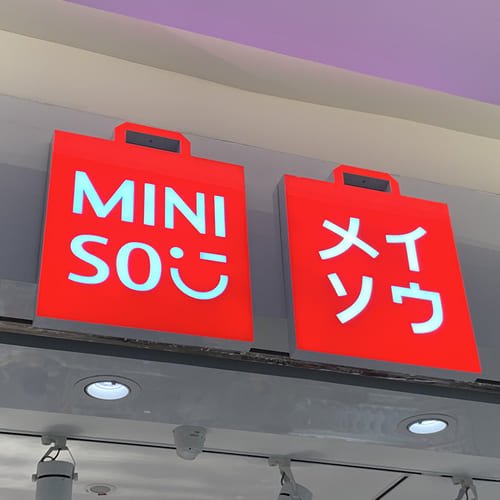
This physical depth is what creates the captivating “3D effect.” As the light changes throughout the day, so do the shadows and highlights cast by the letters. This dynamic quality makes the signage feel alive and ensures it grabs the attention of passersby. They don’t just sit there; they interact with their environment. This is what we mean when we talk about signage that “pops.”
Your brand isn’t flat, so why should your sign be? Dimensional letters bring your logo to life with tangible depth and character.
Key Characteristics of Dimensional Letters
- Depth and Thickness: This is the defining feature. The letters possess a tangible thickness, ranging from a sleek 1/8 inch to a bold and chunky 5 inches or more. This depth is what separates them from any two-dimensional alternative.
- Solid Materiality: Dimensional letters are crafted from solid materials—not just ink on a surface. They are cut, routed, molded, or fabricated from robust substances like metal, acrylic, wood, or foam, each lending its own unique texture and feel.
- Strategic Mounting: The way these letters are attached to a surface is a key part of their appeal. They can be mounted flush against a wall for a clean, integrated look, or installed with spacers to create a “floating effect,” enhancing the shadows and making the letters appear to hover in front of the wall.
Why Choose Dimensional Letters? The Core Benefits for Your Brand
Unparalleled Visibility and Impact
In a crowded marketplace, visibility is currency. The three-dimensional nature of these signs makes them inherently more noticeable than their flat counterparts. They catch the eye from various angles and from much greater distances. A dimensional sign doesn’t just face forward; it commands the space around it. This is especially true when placed on a complex background like a textured brick or stone wall, where a flat sign would be lost. The depth creates a natural contrast that ensures your name is always clear and legible.
Projecting Professionalism and Permanence
The signage you choose sends a powerful, subconscious message about your business. A flimsy, faded banner might suggest a temporary or budget-conscious operation. In contrast, a robust, beautifully crafted dimensional sign exudes permanence, class, and strength. It tells potential customers that you are an established, professional entity that has invested in quality. This impression of stability and success can be a deciding factor for a customer choosing between you and a competitor.
Superior Durability and Longevity
Dimensional letters are built to last. When you choose materials like aluminum, stainless steel, or high-grade acrylic, you are investing in a product designed to withstand the elements. These materials are resistant to fading from UV rays, warping from temperature changes, and general weathering. For any exterior sign, this durability is non-negotiable. A well-made dimensional sign will represent your brand flawlessly for years, making it a wise and cost-effective long-term investment.
Infinite Versatility and Customization
Perhaps the greatest strength of dimensional letter is its incredible versatility. There are virtually no creative limits. You can choose from a massive library of materials, a rainbow of colors, a variety of finishes, and any size imaginable. Do you want your sign to be illuminated? You can have it front-lit, back-lit, or both. This boundless potential for customization ensures that your signage can perfectly align with your unique brand identity, whether it’s rustic and traditional, sleek and modern, or playful and creative.
The Anatomy of Dimensional Letters: Types and Construction
Understanding how dimensional letters are made demystifies the process and helps you choose the perfect type for your needs. The manufacturing method directly impacts the final look, durability, and cost of your signage.
How Are Dimensional Letters Made? A Look at Manufacturing Methods
Flat-Cut Letters: Precision and Clarity
This is one of the most common and versatile methods. Flat-cut letters are precisely cut from flat sheets of solid material using a CNC (Computer Numerical Control) machine. Think of it as an incredibly precise, computer-guided cutting tool.
- The Process: Depending on the material, different tools are used. A laser cutter is perfect for acrylic and wood, producing a polished, clean edge. A water jet uses a high-pressure stream of water to cut through thick metals like stainless steel and aluminum. A router uses a spinning bit to carve out letters from materials like PVC and foam.
- The Result: The key advantage of flat-cutting is the exceptionally clean, sharp edges and tight, crisp corners it produces. This makes it the ideal method for replicating intricate logos and custom fonts with perfect accuracy.
Fabricated / Channel Letters: The Foundation for Illumination
When you see a sign that glows from within, you’re most likely looking at a channel letter. These letters are not solid; they are hollow, three-dimensional “cans” specifically designed to house lighting elements.
- The Construction: The process involves three main parts:
- The Back: A flat piece of aluminum is cut into the shape of the letter. This forms the backbone.
- The Returns: These are the sides of the letter. Strips of aluminum are precisely bent to match the contours of the back and then welded or bonded to it, creating a hollow channel or “can.”
- The Face: A face, typically made of translucent acrylic, is then attached to the front of the can. This face can be colored to match your brand.
- Primary Use: The hollow structure is the entire point. It creates the perfect enclosure for LED modules, allowing the letter to be illuminated safely and effectively.
Formed Plastic Letters: The Economical Choice
Formed plastic letters offer excellent durability and legibility at a budget-friendly price point. They are created through a process called thermoforming.
- The Process: A sheet of plastic (often acrylic or CAB – Cellulose Acetate Butyrate) is heated until it becomes pliable. It is then stretched over a mold of the letter and a vacuum is applied, pulling the plastic tightly into the desired shape.
- Pros and Cons: These letters are very durable and hold up well in exterior environments. However, the molding process results in rounded edges and softer corners, which may not be suitable for designs that require sharp, precise lines. Their glossy, plastic appearance can sometimes scream “branding on a budget,” making them less ideal for high-end applications.
Layered and Laminated Letters: Creating Depth and Texture
This technique is a clever way to achieve a premium look without the associated cost or weight of solid materials.
- Metal Laminates: This popular option involves bonding a thin, real-metal face (like brushed aluminum or polished brass) to a thicker, lighter substrate, such as acrylic or foam. You get the authentic look and finish of metal for a fraction of the price. This is an excellent choice for interior lobby signs, but be aware that from very close proximity, the layered construction may be visible.
- Multi-Layered Acrylic: For a truly custom look, different colors and thicknesses of acrylic can be layered on top of each other. This creates a unique, multi-dimensional effect that adds visual interest and depth to your logo.
A Guide to Illumination: Bringing Your Sign to Life
Illumination transforms your sign from a daytime marker into a 24/7 beacon. It dramatically increases visibility and can be tailored to create a wide range of moods, from bold and bright to soft and sophisticated.
Front-Lit (Standard Channel Letters)
- How it Works: This is the classic illuminated sign. LED modules are placed inside the hollow channel letter, shining forward through the translucent acrylic face.
- The Effect: It creates a bright, bold, and evenly lit letter that is impossible to miss. This is the workhorse of exterior business signage for a reason—it offers maximum visibility.
Back-Lit / Halo-Lit Letters
- How it Works: In this elegant style, the face of the letter is made from opaque metal. The internal LEDs are aimed backward, casting their light onto the mounting surface behind the letter.
- The Effect: This produces a beautiful “halo” of light that outlines the shape of each letter. It’s a more subtle, high-end look that adds an air of sophistication and class, especially popular for restaurants, hotels, and corporate offices.
Edge-Lit Letters
- How it Works: For a truly modern and sleek effect, LEDs can be embedded along the inside perimeter of a solid acrylic letter. The light travels through the acrylic and escapes at the edges.
- The Effect: This creates a subtle, crisp line of light that perfectly traces the letter’s outline. It’s a high-end option that’s perfect when branding requires both detail and illumination.
Open-Face Channel Letters
- How it Works: These signs have either a clear acrylic face or no face at all, leaving the internal light source exposed. This is often done with classic neon tubes or modern, neon-simulating LEDs.
- The Effect: The look is vibrant, energetic, and often has a retro feel. It’s an eye-catching style that’s great for bars, restaurants, and entertainment venues.
Combination Front & Back-Lit
- How it Works: The best of both worlds! These letters have a translucent face that is lit from within, while also casting a halo of light onto the wall behind them.
- The Effect: This combination creates maximum drama and visibility. When you absolutely need your sign to pop, this is the ultimate choice.
A Note on Modern Lighting
Virtually all modern illuminated signs use LEDs (Light Emitting Diodes). The reasons are clear: they are incredibly energy-efficient, operate on safe low-voltage power, and have an exceptionally long lifespan, often rated for 30,000 to 50,000 hours or more. While they are a durable, long-term solution, it’s important to note that if an individual LED module fails after many years of use, it often cannot be serviced individually. In many cases, the entire letter may need to be replaced.
The Ultimate Materials and Finishes Guide
The material you choose is the soul of your sign. It dictates the look, the feel, the durability, and the cost. This section breaks down the most common options to help you make an informed decision that perfectly aligns with your brand and budget.
Which Material is Right for My Sign? A Comprehensive Comparison
The Metal Family: Durability and a Premium Aesthetic
Metal letters impute quality. They convey strength, authority, and a modern sensibility. They are a long-term investment that pays dividends in brand perception.
| Metal Material | Best Use | Look & Feel | Key Characteristics |
|---|---|---|---|
| Aluminum | Exterior & Interior | Sleek, Modern, Versatile | Lightweight, rust-proof, and the most cost-effective metal option. Can be painted any color or given a brushed or polished finish. |
| Stainless Steel | Exterior & Interior | High-End, Industrial, Clean | Extremely durable and corrosion-resistant. Heavier and more expensive than aluminum but offers a superior, high-end look. |
| Bronze & Brass | Exterior & Interior | Classic, Elegant, Luxurious | Convey a sense of tradition and prestige. They will develop a natural, beautiful patina over time unless sealed. The most premium-priced options. |
| Copper | Exterior & Interior | Warm, Rustic, Unique | Has a distinct warm hue that patinas to a beautiful verdigris green. A unique choice for artisanal or high-end brands. |
| Corten Steel | Exterior | Industrial, Rustic, Artistic | Also known as “weathering steel,” it’s designed to form a stable, protective rust-like layer. Perfect for a rugged, industrial aesthetic. |
Plastics & Acrylics: The Apex of Versatility and Color
When it comes to color and clean lines, nothing beats acrylic. It’s the chameleon of the sign world, able to fit nearly any brand identity with precision and pop.
| Plastic Material | Best Use | Look & Feel | Key Characteristics |
|---|---|---|---|
| Flat-Cut Acrylic | Exterior & Interior | Polished, Modern, Crisp | Offers perfectly crisp, laser-cut edges. Available in a huge range of standard colors and can be painted to match any Pantone color. Comes in glossy or matte finishes. |
| Routed PVC | Interior Only | Clean, Economical, Matte | An excellent value proposition, providing a high-level look on a budget. It’s lightweight and paints very well, but it is softer and more prone to scratches than acrylic. |
| Formed Plastic | Exterior & Interior | Bold, Legible, Glossy | Very durable and cost-effective for exterior letters with depth. The molding process results in rounded edges, and the finish is typically a high gloss. |
Foams & Composites: Lightweight and Budget-Friendly Solutions
Foam-based products offer a lightweight and highly versatile alternative, capable of creating thick, impressive letters without the weight or cost of other materials.
| Foam/Composite Material | Best Use | Look & Feel | Key Characteristics |
|---|---|---|---|
| HDU (High-Density Urethane) | Exterior & Interior | Textured, Carved, Versatile | A completely waterproof and weather-resistant foam. It can be sandblasted or carved to create textured effects like a wood grain or stucco finish. Can be painted any color. |
| Styrofoam / EPS Foam | Interior / Temporary | Bold, Lightweight, Economical | Extremely lightweight and affordable, making it perfect for event signage, trade shows, or temporary displays. Can be coated for more durability. |
Natural & Unique Materials
- Wood: For a warm, natural, or rustic aesthetic, nothing compares to real wood. Cedar and redwood are excellent for outdoor use, while walnut and mahogany provide a sophisticated interior look. Wood can be stained to enhance its grain or painted. It requires proper sealing to protect it from the elements.
- Concrete: For a bold, industrial, and modern statement, concrete letters are an option. They are extremely durable but also incredibly heavy, requiring specialized installation and structural support.
- A World of Options: The possibilities are nearly endless. The industry offers everything from Crystal and Glass for a high-end look, to Leather and Felt for unique interior applications, proving that if you can dream it, a sign professional can likely create it.
The Finishing Touch: How Textures and Coatings Elevate Your Sign
The finish is what gives your sign its final personality. It can transform a standard material into something truly special.
Paint Finishes
- Matte: A non-reflective finish that provides a soft, modern, and sophisticated look.
- Satin: A popular choice that offers a subtle sheen—not too flat, not too shiny.
- Gloss: A highly reflective, shiny finish that makes colors pop and creates a bold statement.
- Pantone (PMS) Color Matching: For perfect brand consistency, sign professionals can custom-mix paints to match your exact corporate colors, ensuring your sign is a seamless extension of your brand identity.
Metal Finishes
- Brushed: This finish is created by sanding the metal in one direction to create a fine, linear grain. It’s a very popular choice for a clean, contemporary look.
- Polished: The metal is buffed to a smooth, mirror-like finish. It’s highly reflective and creates a luxurious, high-end appearance.
- Anodized: An electrochemical process used on aluminum that creates a hard, durable, and decorative oxide layer. It provides excellent corrosion resistance.
A sign’s finish is like the final note in a symphony. It’s the subtle detail that brings the entire composition together and leaves a lasting impression.
The Design and Ordering Process: From Concept to Reality
A great sign doesn’t happen by accident. It’s the result of careful planning and a collaborative design process. This section will guide you through the critical steps of turning your vision into a physical, impactful sign.
Step 1: How to Design Effective Dimensional Signage
Aligning with Brand Identity
Your sign should be a physical embodiment of your brand’s personality. Every design choice should reinforce your brand story. Is your company a modern, forward-thinking tech firm? Sleek, brushed aluminum or backlit acrylic might be a perfect fit. Are you a wellness spa focused on natural tranquility? Consider warm, stained cedar wood or letters with a soft, matte finish. The materials, colors, and typography must all work in harmony to send a consistent and powerful message about who you are.
Determining the Right Size, Scale, and Visibility
How big should your letters be? The answer depends entirely on where your audience will be. A sign that’s too small will be illegible from a distance, while one that’s too large can overwhelm its surroundings. There’s a direct relationship between letter height and the maximum distance at which it can be easily read.
As a rule of thumb, for every inch of letter height, you gain approximately 10 feet of visibility. However, for maximum impact and quick readability, especially for drivers, a more generous scale is recommended.
Here’s a general guide to consider:
- 10-inch letters: Readable up to about 250 feet, suitable for pedestrian traffic or slow-moving cars.
- 24-inch (2-foot) letters: Visible from up to 500-600 feet, good for storefronts on moderately busy roads.
- 48-inch (4-foot) letters: Can be seen from over 1000 feet away, ideal for buildings near highways or that need to be seen from a great distance.
An experienced sign designer can help you determine the perfect scale by creating a proof that superimposes your proposed sign onto a photo of your building, ensuring the proportions are just right.
Choosing Typography That Speaks Volumes
The font you choose does more than spell out your name; it conveys emotion and personality. A classic serif font can communicate tradition and reliability. A clean, sans-serif font feels modern and direct. A flowing script font can feel personal and artistic. The most important consideration, however, is readability. A font that is overly complex or delicate may look great on a business card but can become an unreadable blur from 50 feet away. It’s also critical to ensure that any thin strokes or wispy elements in your logo are thick enough to be fabricated without breaking, which a sign designer can help you adjust.
Planning for Location and Lighting
Where your sign will live dictates many design choices. An exterior sign must be made from weather-resistant materials like aluminum or acrylic. An interior sign gives you more freedom to use materials like PVC or foam laminates.
You must also consider natural light. A sign placed near a window or outdoors in a sunny location can benefit from natural visibility. However, be cautious with highly reflective materials. A polished metal or gloss acrylic sign can create a blinding glare if it catches the sun at the right angle, making it difficult to read. If your sign needs to be visible at night or is located in a dimly lit interior space, you will need to incorporate an illumination strategy from the start.
Step 2: How to Order and Work with a Signage Professional
While a capable in-house design team is a great asset, partnering with a custom sign company is invaluable. Their designers possess specialized knowledge of the limitations and strengths of different materials and fabrication techniques, ensuring your design is not only beautiful but also buildable and durable.
The Value of an Expert Partner
A high-level sign company is more than just a manufacturer; they are your project partner. They will guide you through material selection, offer different pricing options, ensure your design is optimized for production, handle all the logistics of ordering, and have the certified resources to install your sign correctly and safely.
The Typical Workflow
- Consultation & Quote: The process begins with a conversation. You’ll discuss your vision, your brand, your location, and your budget. The sign company will then provide a detailed quote outlining different options.
- Design & Proofing: Once you move forward, you’ll provide your logo in a high-resolution vector format (typically an .AI, .EPS, or .PDF file). This is crucial for ensuring the final product is perfectly crisp. The design team will then create a formal proof—a digital rendering of your sign, often shown to scale on a photo of your installation wall—for your final approval.
- Manufacturing: After you approve the proof, your sign goes into production. The team of fabricators will use their specialized machinery to bring your design to life with precision and care.
- Installation: The final step is installation. The company will coordinate a time that works for you and their team of professional installers will mount your sign, ensuring it is secure, level, and perfectly placed.
Installation and Maintenance: Protecting Your Investment
Your dimensional sign is a high-end product, and its final appearance and longevity depend heavily on proper installation and care. This is the final, critical step in bringing your brand to life.
The Definitive Installation Guide for Dimensional Letters
Professional vs. DIY Installation: A Critical Decision
While it might be tempting to save money by installing the sign yourself, we strongly recommend outsourcing the installation to an experienced, insured sign company. Dimensional letters are heavier and more complex to mount than a simple banner.
The risks of a DIY approach are significant:
- Improper Spacing: Achieving perfect, professional-looking alignment and spacing between letters is extremely difficult without experience and the right tools.
- Damage to Property: You could easily damage the letters themselves or the wall surface, leading to costly repairs.
- Personal Injury Liability: Most installations require ladders, scaffolding, or even a lift. A fall from even a modest height can cause serious injury and become a major liability for your company.
A professional installer has the knowledge, tools, and insurance to handle the job safely and flawlessly, ensuring your investment is protected and your sign looks its absolute best.
Understanding Mounting Methods and When to Use Them
The best mounting method depends on the weight of the letters, the type of wall surface, and the desired final look.
- Stud Mount: This is the most common and secure method. Threaded metal rods (“studs”) are fixed into the back of each letter. The installer drills holes into the wall, fills them with an adhesive like silicone, and inserts the studs. This method is essential for heavy letters and for mounting onto textured surfaces like brick, stone, or stucco, where tape would fail.
- Standoff / Spacer Mount: This is a variation of the stud mount. Small metal tubes (the “standoffs” or “spacers”) are placed over the studs between the letter and the wall. This makes the letters “float” off the surface, typically by ½ inch or more, which enhances the 3D effect by creating more distinct shadows.
- Adhesive / VHB Tape Mount: For very lightweight, small letters being installed on a perfectly smooth, clean, and flat interior surface (like painted drywall), a high-bond double-sided tape (VHB – Very High Bond) can be used. This allows for a completely flush mount with no visible hardware.
- Rail Mount: For signs with many letters that need to be perfectly aligned in a straight line, a rail mount is a great option. The letters are pre-mounted onto a horizontal metal bar (the rail) at the factory. The installer then only needs to mount the one or two rails to the wall, guaranteeing perfect alignment.
The Importance of the Installation Pattern
To ensure a flawless installation, professional sign companies provide a full-size paper template, often called a “pounce pattern.” This pattern has the exact layout of your sign printed on it, with markings showing precisely where each hole needs to be drilled for the studs. The installer tapes this pattern to the wall, drills through the markings, and then removes the paper, leaving a perfect guide for mounting the letters.
How to Care for and Maintain Your Dimensional Signage
Proper care is simple but vital for keeping your sign looking brand new for years to come.
Routine Cleaning
Regular cleaning prevents dirt and grime from building up. For most materials, all you need is a soft, non-abrasive cloth and a mild solution of soap and water. Gently wipe the surfaces to remove dust and smudges. It is critical to avoid abrasive cleaners, harsh chemicals (like ammonia or alcohol), or rough sponges, as these can easily scratch or damage the finish, especially on acrylic and polished metals.
Periodic Inspections
Once or twice a year, take a moment to inspect your sign. Check for any letters that may have become loose. If your sign is illuminated, look for any flickering or dead LED modules. Addressing any small issues promptly will prevent them from becoming bigger problems and will ensure your sign continues to represent your brand with the quality it deserves.
Applications, Cost, and FAQs
Now that you understand the what, why, and how of dimensional letters, let’s explore where they are used and what you can expect to invest.
Where Are Dimensional Letters Used? Applications Across Industries
The versatility of dimensional signage makes it a powerful branding tool for virtually any industry. Its ability to enhance visibility and professionalism translates across all sectors.
- Corporate & Office Spaces: Dimensional letters are a staple for creating a strong first impression in a corporate lobby. They are also used for wayfinding signage, branding conference rooms, and creating an inspiring office environment.
- Retail & E-Commerce: Bold storefront signs attract customers from the street. Inside, dimensional letters can be used for departmental signs, window displays, and point-of-purchase branding.
- Hospitality & Restaurants: An elegant exterior sign creates a welcoming atmosphere. Dimensional letters are also perfect for unique interior décor, host stands, and stylish menu boards.
- Healthcare & Medical Facilities: Clear, professional signage is crucial for guiding patients. Dimensional letters are used for building identification, departmental wayfinding, and creating a sense of trust and organization.
- Education & Nonprofits: From university building names to campus directories, dimensional signage helps students and visitors navigate large spaces while reinforcing the institution’s identity.
- Events & Trade Shows: In a crowded convention hall, an eye-catching dimensional logo on your booth can make all the difference, drawing attendees in and making your brand memorable.
What is the Price of Dimensional Signs? Demystifying the Cost
There is no one-size-fits-all price for a dimensional sign. The cost is a reflection of the materials, complexity, and labor involved in creating a truly custom product.
The Key Factors That Influence Price
- Material: This is often the biggest cost driver. Foam and PVC are on the lower end, while solid premium metals like bronze and brass are at the top.
- Size and Thickness: It’s simple: larger and thicker letters require more material and more time to produce, which increases the cost.
- Complexity of Design: A simple block font is far easier and quicker to fabricate than a complex, intricate logo with many small parts.
- Finish: A standard painted finish is the most economical. Custom finishes like a true metal patina, gold leaf, or multi-color gradients will add to the price.
- Illumination: Adding any form of lighting is a significant cost factor, as it involves LEDs, wiring, power supplies, and more complex fabrication and installation.
- Installation: The difficulty of the installation plays a role. A simple interior wall mount will cost less than an installation on the 10th floor of a building requiring a crane and street permits.
General Price Tiers
To give you a general idea, we can group materials and styles into budget tiers, using a simple dollar-sign system.
| Price Tier | Sign Types | Description |
|---|---|---|
| $ | Formed Plastic, Routed PVC, Foam Letters | These are the most budget-friendly options, excellent for interior applications or when a high-end look is needed on a tight budget. |
| $$ | Flat-Cut Acrylic, Metal Laminate Letters | The mid-range, offering a significant step up in quality and finish. These are some of the most popular choices for professional interior and exterior signs. |
| $$$ | Standard Metal Letters (Aluminum), Standard Channel Letters | This tier includes solid metal and basic illumination. These are premium, highly durable signs that make a strong statement. |
| $$$$ | Premium Metals (Bronze, Brass), Complex Illuminated Signs | The highest end of the spectrum, featuring luxurious materials and advanced lighting techniques like combination front/back-lit or edge-lit letters. |
Frequently Asked Questions (FAQ)
Q: What is the difference between dimensional letters and channel letters?
A: This is a great question. All channel letters are a type of dimensional letter, but not all dimensional letters are channel letters. The key difference is construction: dimensional letters are typically solid (like flat-cut metal or acrylic), while channel letters are hollow (fabricated with a back and sides) specifically so they can be internally illuminated.
Q: How long do dimensional letters last?
A: Longevity depends almost entirely on the material and location. High-quality exterior-grade materials like aluminum, stainless steel, and acrylic can easily last for 10-15 years or more with minimal care. Interior letters, protected from the elements, can last indefinitely.
Q: Can I install dimensional letters myself?
A: While technically possible for very small and lightweight interior signs, it is strongly discouraged. To ensure the sign is secure, perfectly level, and to avoid personal injury or damage to your property, a professional, insured installer is always the best choice.
Q: What file format do I need for my logo?
A: You will need to provide your logo in a vector format. These files are made of lines and curves rather than pixels, allowing them to be scaled to any size without losing quality. Common vector file types are .AI (Adobe Illustrator), .EPS, or a vector-based .PDF.
Q: Which is better for an outdoor building sign: plastic or metal?
A: Both can be excellent choices. Metal (especially aluminum) offers a premium, high-end look and superior long-term durability, making it a fantastic investment. Plastic (specifically acrylic or formed plastic) is more cost-effective and offers a wider range of vibrant color options. Modern plastics are very durable, but metal will generally have a longer lifespan in harsh weather conditions.
Q: How thick should my dimensional letters be?
A: Our most popular depth for a substantial, professional look is 1/2 inch. Thinner letters (1/4 inch) work well for secondary text or on a tight budget. Thicker letters (3/4 inch to 1 inch or more) create a bolder, more dramatic effect that is excellent for large-scale signs where you want maximum impact.
Take Your Brand to the Next Dimension
We’ve journeyed through the entire world of dimensional letters, from foundational concepts to the finest details of fabrication and finishing. It’s clear that this form of signage is far more than just a way to display your name. It is a powerful, versatile, and high-impact branding tool that communicates quality, builds trust, and ensures your business gets the attention it deserves.
A great sign is an investment—an investment in your brand identity, in your professional image, and in your visibility within the community. It works for you day and night, making a lasting impression on every person who sees it.
Ready to elevate your brand and make a statement that truly stands out?
Explore the possibilities for your business and get a custom quote to bring your vision to life. It’s time to take your brand to the next dimension.