The Foundations: What Makes a Font Good for Signs?

Before we jump into a list of fonts, you need to understand the “why.” What separates a functional, effective font from a decorative flop? It comes down to a few core principles that every successful sign must follow. Master these, and you’re already halfway to a great design.
1.1. Readability: The Non-Negotiable Priority
Let’s be crystal clear: if your sign cannot be easily read, it has failed. Period. Your message, no matter how clever or compelling, is lost. Readability isn’t a matter of taste; it’s a science based on how our eyes and brains process information, especially from a distance and in a hurry.
“A sign typically has 10 feet of viewing distance for every inch of letter height. This simple rule is your starting point for any signage project.”
This means if you want your sign to be legible from 50 feet away, your letters need to be at least 5 inches tall. It’s a simple but crucial calculation that prevents businesses from creating signs that are only readable to someone standing directly in front of them. Here’s a quick guide:
| Letter Height | Maximum Readable Distance | Best Use Case |
|---|---|---|
| 1 inch | 10 feet | Door signs, small indoor notices |
| 3 inches | 30 feet | Sidewalk A-frame signs, storefront windows |
| 6 inches | 60 feet | Most storefront building signs |
| 12 inches (1 foot) | 120 feet | Roadside signs, large banners |
But size is just one piece of the puzzle. Other factors dramatically affect legibility:
- X-Height: This is a technical term for the height of a lowercase ‘x’ in a font. Fonts with a taller x-height, like Helvetica or Open Sans, feel more open and are easier to read from a distance because the main body of the letters is larger and clearer.
- Letter Spacing (Kerning & Tracking): Kerning is the space between two specific letters, while tracking is the overall spacing across a word or sentence. Fonts with letters that are too squished together or too far apart force the brain to work harder to identify words, slowing down comprehension. A good signage font has balanced, even spacing.
- Simplicity: The human brain is wired to recognize simple shapes quickly. Fonts with clean lines and no extra frills (flourishes, excessive details) are processed much faster. This is why sans-serif fonts are often the default choice for signage that needs to deliver a message in a split second.
1.2. Brand Identity & Font Psychology
A font does more than just form words; it whispers a story about your brand before a single word is read. This is font psychology in action. Every curve, line, and stroke carries an emotional weight and a set of associations. Choosing a font that aligns with your brand’s personality is essential for making the right first impression.
Think about these common associations:
- Serif Fonts (like Times New Roman, Garamond): These fonts have small “feet” on the ends of their letters. They feel traditional, trustworthy, authoritative, and elegant. They are the go-to choice for institutions that want to convey a sense of heritage and respectability, like law firms, universities, and luxury brands.
- Sans-Serif Fonts (like Helvetica, Futura): “Sans” means “without,” so these fonts lack the extra feet. They feel modern, clean, efficient, and approachable. This is the language of tech startups, modern retail stores, and public transportation systems.
- Script Fonts (like Pacifico, Allura): These mimic handwriting and feel elegant, creative, and personal. They are perfect for businesses that want to feel one-of-a-kind, like boutiques, bakeries, or high-end restaurants.
- Slab Serif Fonts (like Clarendon, Rockwell): These have thick, blocky serifs, giving them a sturdy, bold, and sometimes rustic feel. They convey strength and reliability, making them great for outdoor brands, craft breweries, and any business wanting a vintage vibe.
Choosing a font that clashes with your brand’s message creates cognitive dissonance. A high-tech software company using a frilly script font would feel just as wrong as a children’s daycare using a stern, traditional serif.
1.3. The Power of Consistency
Finally, your sign doesn’t exist in a vacuum. It’s a key part of your overall brand identity. If your business has established Brand Guidelines, they are not to be ignored when designing a sign. Using the same (or complementary) fonts across your website, social media, business cards, and physical signage creates a cohesive and recognizable brand experience. Consistency builds trust. When a customer sees your sign and it feels familiar because it matches your online presence, you’ve reinforced their connection to your brand before they even walk through the door.
Typography 101: Understanding the Main Font Categories
To choose the right tool for the job, you first need to understand your toolbox. Fonts are generally grouped into a few major categories, each with its own distinct personality and purpose. Here’s a simple breakdown of the main types you’ll encounter.
2.1. Serif Fonts
What they are: These are the classic fonts that have small decorative lines—or “serifs”—at the ends of their strokes. Think of the font you see in most novels or newspapers.
The Vibe: Traditional, formal, elegant, and trustworthy. Their history is tied to the printed word, giving them a feeling of authority and heritage.
Best for Signage: Serif fonts are excellent for signs that will be viewed up close, where the details can be appreciated. They are perfect for businesses that want to project a sophisticated and established image, such as law offices, financial institutions, high-end restaurants, or historical markers.
2.2. Sans-Serif Fonts
What they are: As the name implies (“sans” is French for “without”), these fonts lack the small serifs. Their lines are clean, crisp, and uniform.
The Vibe: Modern, clean, simple, and direct. They became popular in the 20th century with the rise of modernism and are now the standard for digital text on screens.
Best for Signage: Sans serifs are the undisputed champions for most signage needs. Their simplicity makes them incredibly easy to read from a distance, making them ideal for outdoor signs, billboards, wayfinding systems, and retail promotions where clarity is key.
2.3. Script & Cursive Fonts
What they are: These fonts are designed to look like handwriting or calligraphy, with flowing, often connected letters.
The Vibe: Elegant, personal, creative, and sometimes whimsical. They add a human touch to a design.
Best for Signage: Use these with extreme caution! While beautiful, they are often difficult to read quickly. They work best for a single, large word or a short phrase (like a logo) where style is the main goal. A bakery’s sign might use a script font for the word “Sweets,” but it would be a mistake to use it for the address or hours of operation.
2.4. Display & Decorative Fonts
What they are: This is a broad category of stylized fonts designed specifically to grab attention at large sizes. They can be playful, artistic, themed, or just plain loud.
The Vibe: Unique, eye-catching, and full of personality. Their purpose is to make a bold statement.
Best for Signage: Display fonts are perfect for headlines on posters, event banners, and logos for brands with a strong theme (like a comic book store or a retro diner). However, they are almost always a poor choice for smaller text, as their details can become messy and illegible.
The A-List: 20+ Best Fonts for Signs, Posters, and Banners
Now for the main event. We’ve curated a list of the most effective and widely respected fonts for signage, drawing from the consensus of professional designers. We’ve broken them down by category to help you find the perfect match for your brand’s voice.
A. The Sans-Serif Champions (The Workhorses)
These are the go-to, can’t-go-wrong choices for most signage projects. They prioritize clarity, modernity, and function.
1. Helvetica
- Vibe: Neutral, professional, timeless. Often called the “little black dress” of fonts because it works for almost any occasion.
- Why it Works: It boasts near-perfect clarity and legibility at any size. Its letterforms are balanced and unobtrusive, allowing the message to be the hero.
- Best For: Corporate signage, directional and wayfinding systems (it’s the official font of the New York City Subway), safety signs, and any application where clear, unambiguous communication is the top priority.
- The Catch: Its immense popularity means it can sometimes feel a bit generic or “safe.” If you’re trying to stand out with a unique personality, you might want to explore other options.
2. Futura
- Vibe: Modern, geometric, sleek, and efficient. It feels forward-thinking and stylish.
- Why it Works: Based on simple geometric shapes (circles, squares, triangles), Futura’s clean lines and even strokes give it a highly organized and purposeful feel. It’s the font that was chosen for the plaque left on the moon by the Apollo 11 astronauts!
- Best For: Tech companies, fashion-forward brands (like Supreme), automotive brands (like Volkswagen), and modern architectural signage.
- The Catch: Its low x-height can make it slightly less legible in long blocks of small text compared to a font like Helvetica.
3. Gotham
- Vibe: Authoritative, yet friendly and approachable. Strong, geometric, and distinctly American.
- Why it Works: Famously used in Barack Obama’s 2008 presidential campaign, Gotham was designed to be both powerful and optimistic. Its wide, open letterforms make it incredibly easy to read from a distance.
- Best For: Storefront signs, political campaigns, modern brands that need to feel both trustworthy and contemporary.
4. Arial
- Vibe: Accessible, familiar, and reliable. It’s the font everyone has on their computer.
- Why it Works: Arial was created as a digital-age alternative to Helvetica, so it shares many of its strengths in clarity and legibility. Its universal availability makes it a safe and practical choice.
- Best For: General office signage, informational signs, and situations where you need a dependable, no-cost option that will get the job done without any fuss.
5. Proxima Nova
- Vibe: Modern and geometric, but with a humanistic warmth that makes it feel less clinical than Futura.
- Why it Works: It’s a perfect hybrid, bridging the gap between classic geometric fonts and more friendly, rounded ones. It’s highly legible on both print signs and digital screens.
- Best For: Trade show displays, corporate banners, websites, and any brand that wants to look current and sophisticated without being cold.
6. Open Sans
- Vibe: Open, neutral, and exceptionally friendly. Designed for maximum readability.
- Why it Works: Commissioned by Google, Open Sans was optimized from the ground up for legibility on screens and in print. It has a tall x-height and clear letterforms, making it a fantastic choice for signs with more than just a few words.
- Best For: Wayfinding systems, instructional signs, digital menus, and safety signs where absolute clarity is essential.
7. Montserrat
- Vibe: Urban, stylish, and geometric with a touch of retro charm.
- Why it Works: Inspired by old posters from the Montserrat neighborhood of Buenos Aires, this font has a unique character that feels both trendy and timeless. It’s a favorite among designers for its versatility.
- Best For: Event signage, modern retail promotions, creative agencies, and storefronts that want a clean but character-filled look.
8. Bebas Neue
- Vibe: Bold, condensed, and impactful. It’s all caps and demands attention.
- Why it Works: Its tall, narrow letterforms allow you to create huge, powerful headlines without taking up a lot of horizontal space. It’s perfect for making a strong, quick statement.
- Best For: Sale banners (“50% OFF!”), event posters, and any sign that needs to shout its message from the rooftops.
9. Myriad
- Vibe: Clean, readable, and corporate with a gentle, humanistic touch.
- Why it Works: For years, Myriad was Apple’s corporate font, and it carries a sense of clean, user-friendly design. It’s professional without being as rigid as Helvetica.
- Best For: Brand signage for tech or service companies, conference banners, and professional settings.
10. Franklin Gothic
- Vibe: Strong, classic, and impactful. A hardworking American sans-serif.
- Why it Works: This font has a certain heft and power that makes it stand out. It’s been a newspaper headline staple for over a century for a reason.
- Best For: Attention-grabbing headlines, banners, and any sign that needs a bold, no-nonsense feel.
- The Catch: Its characters are naturally a bit condensed, which some designers feel can look “squashed” if not given enough space.
B. The Serif Stalwarts (Class & Tradition)
For brands that value heritage, elegance, and authority, these serif fonts are timeless choices.
11. Trajan
- Vibe: Epic, classic, authoritative, and deeply elegant. This is the font of movie posters, ancient Rome, and institutions.
- Why it Works: Based directly on the carved lettering on Trajan’s Column in Rome, its letterforms are inherently grand and command respect. It looks especially powerful in all caps.
- Best For: Law firms, universities, museums, historical plaques, luxury brands, and church signs.
- The Catch: Its heavy use in Hollywood has made it a bit of a cliché in that context. It is also a premium, Adobe-trademarked font.
12. Garamond
- Vibe: Timeless, graceful, and highly readable. It’s an old-style serif that feels both classic and warm.
- Why it Works: Garamond is renowned for its legibility, especially in smaller sizes, making it one of the few serif fonts that works well for more detailed text on a sign.
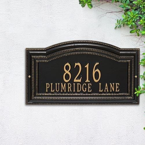
- Best For: Signs with secondary information (like menus or directories), house numbers, museum signage, and businesses with a rich heritage.
13. Bodoni
- Vibe: High-fashion, dramatic, and sophisticated. A modern serif with a sharp, glamorous edge.
- Why it Works: Its design is built on a dramatic contrast between very thick and hair-thin strokes. This makes it visually stunning and eye-catching.
- Best For: Luxury fashion brands (think Vogue or Zara), high-end boutiques, and elegant event signage.
- The Catch: Those beautiful thin strokes can become nearly invisible from a distance or when used on certain materials, so it’s best for signs viewed up close.
14. Times New Roman
- Vibe: Traditional, authoritative, and deeply familiar.
- Why it Works: Commissioned by The Times of London for maximum readability in print, it’s a workhorse font that is both legible and space-efficient.
- Best For: Informational plaques, professional service signs (like for lawyers or accountants), and any context where you need to convey seriousness and tradition.
- The Catch: As a default font on most computers, it can sometimes be perceived as uninspired or lacking in creativity.
C. The Slab & Rustic Stylists (Bold & Earthy)
These fonts have a strong, grounded presence, perfect for brands that are robust, vintage, or down-to-earth.
15. Clarendon
- Vibe: Chunky, bold, reliable, and classic with a touch of rustic charm.
- Why it Works: As one of the first patented fonts, Clarendon is a quintessential slab serif. It’s sturdy, confident, and very easy to read, making it a powerful choice for making a statement.
- Best For: “FOR SALE” signs, businesses with a vintage or Western theme, craft breweries, and cafes.
16. Rockwell
- Vibe: Geometric, strong, and confident. A no-nonsense slab serif.
- Why it Works: Its strokes have a consistent, even weight, which gives it a very stable and dependable appearance.
- Best For: Headings on signs for professional services (like engineering or construction) or any message that needs to feel solid and reliable.
D. The Elegant & Unique Choices (For a Special Touch)
When you need something a little different, these fonts offer unique character without sacrificing function.
17. Optima
- Vibe: Graceful, elegant, and minimalist. A sans-serif with a subtle flare.
- Why it Works: Optima is unique because it doesn’t have serifs, but the ends of its strokes gently flare out. This gives it a touch of classic elegance while maintaining the clarity of a sans-serif.
- Best For: Upscale retail, cosmetic brands, spas, and formal event banners.
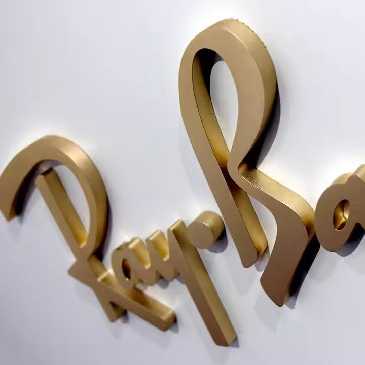
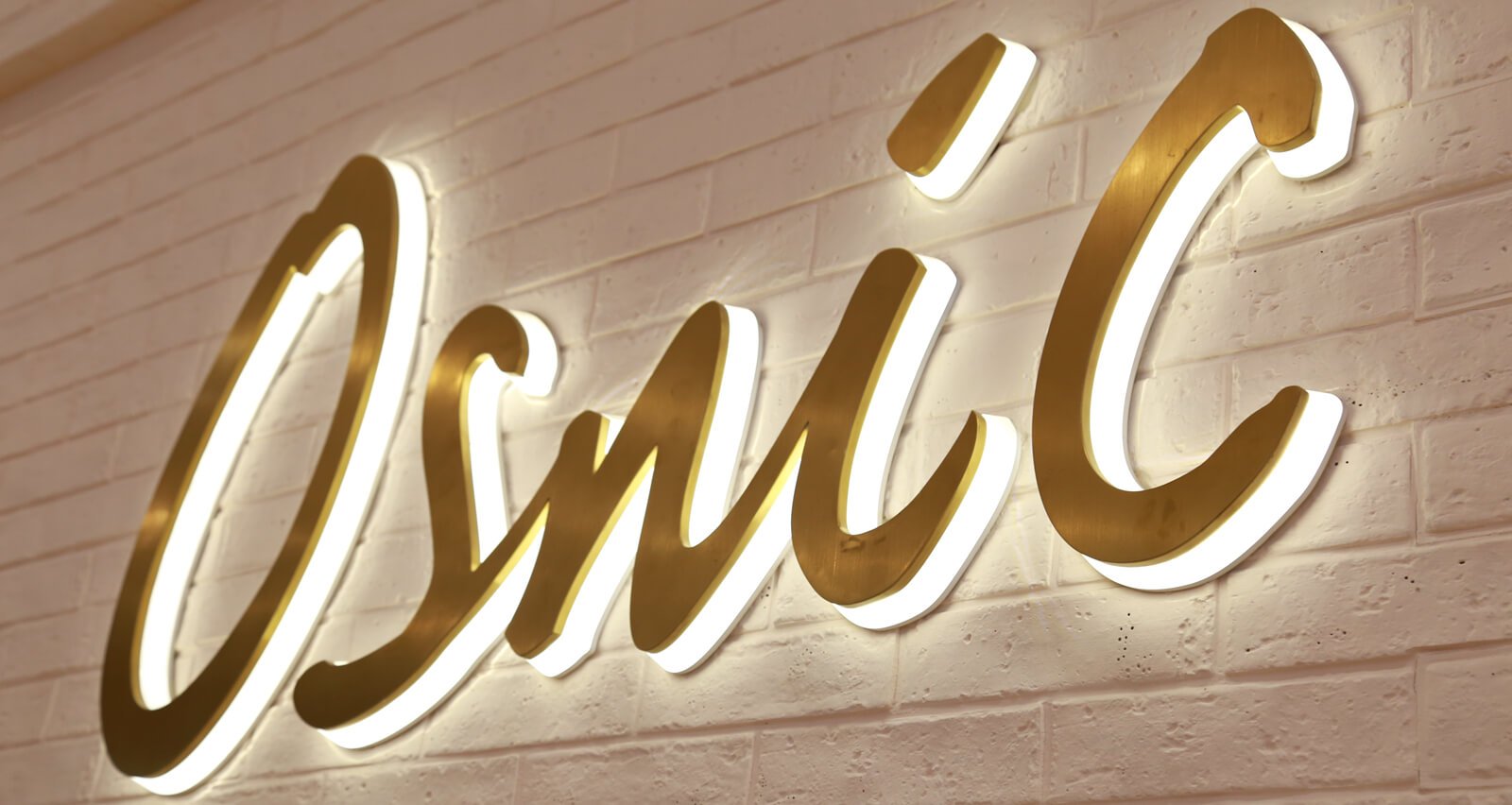
18. Architectural / Ribbon
- Vibe: Custom, high-end, and three-dimensional.
- Why it Works: These aren’t standard digital fonts, but rather custom styles designed specifically for physical, dimensional lettering (like cast or cut metal). They are crafted to interact beautifully with light and shadow, creating a prismatic, 3D effect.
- Best For: Prestigious building names, memorial plaques, and high-end architectural signage that is meant to be a permanent work of art.
19. Monotype Corsiva
- Vibe: A clear, legible, and formal script.
- Why it Works: If your brand absolutely requires a script font, this is one of the most readable options available. It avoids being overly complex while still feeling handwritten and elegant.
- Best For: Small businesses wanting a personal touch, like a local bakery, a salon, or a flower shop, for short words or phrases.
20. Kabel
- Vibe: Unique, with calligraphic and Art Deco influences.
- Why it Works: Kabel is a geometric sans-serif that breaks the mold with quirky, humanistic details, like the angled crossbar on the ‘e’. It feels modern, elegant, and a little bit artistic.
- Best For: Logos, signs for fashion boutiques, and pop-culture-related branding that needs a distinctive, stylish feel.
The Hall of Shame: 6 Fonts You Should (Almost) Never Use on Signs
While design can be subjective, some fonts have become so notorious for their misuse that they are widely considered unprofessional for most signage. Using them can instantly signal an amateur design and damage your brand’s credibility. Here are the main culprits to avoid.
“Your font is the outfit your words wear. Choosing Comic Sans for a professional sign is like showing up to a board meeting in a clown suit.”
1. Comic Sans
Why it Fails: Designed for a children’s software program, Comic Sans is inherently informal and playful. When used for anything serious—from a corporate memo to a storefront sign—it comes across as unprofessional and childish. Its overuse in the 90s has turned it into a design punchline.
2. Papyrus
Why it Fails: This font’s ragged edges and “ancient” feel made it a popular choice for anything wanting to seem rustic or exotic. Unfortunately, it became so overused (famously for the movie Avatar, as lampooned in a classic SNL skit) that it now just looks clichéd and dated. On a large sign, its textured details become messy and hard to read.
3. Brush Script
Why it Fails: Like many script fonts, Brush Script is difficult to read from a distance. The flowing, connected letters can blur together, forcing people to slow down to decipher your message. It also carries a strong retro vibe from the 60s and 70s that can make your brand look dated rather than classic.
4. Curlz MT
Why it Fails: This font is the definition of “overly decorative.” The excessive curls and flourishes on every letter make it incredibly difficult to read, especially in all caps. It feels whimsical to the point of being immature and is not suitable for any business trying to be taken seriously.
5. Jokerman / Bonzai
Why it Fails: These are classic examples of display fonts that are all style and no substance. Their highly stylized and complex letterforms lose all clarity when viewed from more than a few feet away. They are distracting and functionally useless for most signage.
6. Any Overly Thin or Complex Script Font
Why it Fails: As a general rule, avoid any font where the artistic flourishes get in the way of its primary job: to be read. Delicate, thin-lined script fonts might look beautiful on a wedding invitation, but on an outdoor sign, they will be rendered invisible by sunlight, distance, and weather.
From Font to Finish: Pro Design Principles for Effective Signage
Choosing a great font is the first step. How you use it is what truly makes a design successful. Follow these professional principles to ensure your sign is not just readable, but also visually appealing and effective.
5.1. The Rule of Three
Keep it simple. A common mistake is to use too many different fonts, which creates a chaotic and unprofessional look. The golden rule is to never use more than three fonts on a single sign. In most cases, one or two is ideal. A single, versatile font family with multiple weights (like Light, Regular, and Bold) is often all you need.
5.2. The Art of Pairing Fonts
If you do use two fonts, the key is contrast. You want them to be different enough to be distinct, but complementary enough to work together. A good strategy is to pair a font from one category with a font from another.
| Headline Font (High Impact) | Body/Sub-Head Font (Readable) | Why it Works |
|---|---|---|
| Bebas Neue (Bold Sans-Serif) | Open Sans (Neutral Sans-Serif) | Contrast in weight creates a clear hierarchy. |
| Playfair Display (Elegant Serif) | Lato (Simple Sans-Serif) | The classic pairing of a stylish serif with a clean sans-serif. |
| Rockwell (Strong Slab Serif) | Montserrat (Geometric Sans-Serif) | A bold, sturdy headline is balanced by a modern, clean sub-text. |
5.3. Mastering Visual Hierarchy
Visual hierarchy is about guiding the viewer’s eye to the most important information first. Use size, weight, and color to create a clear path.
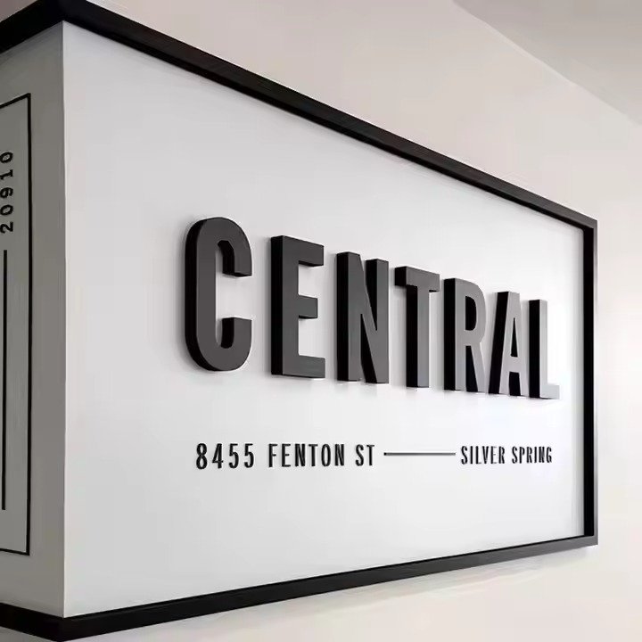
- Primary Message: Your business name or main offer (e.g., “Grand Opening”). This should be the largest and boldest text.
- Secondary Message: A tagline or key details (e.g., “Fresh Coffee & Pastries”). This should be smaller.
- Tertiary Information: Your address, website, or phone number. This should be the smallest, but still perfectly legible.
5.4. Color and Contrast are King
A great font can be ruined by poor color choices. For maximum readability, you need high contrast between your text and the background. The classics are classic for a reason:
- Excellent Contrast: Black on white, white on black, black on yellow, white on dark blue, dark grey on a light background.
- Poor Contrast (Avoid): Light grey on white, red on blue, yellow on light green. These combinations can cause the letters to “vibrate” or blend into the background.
Also, consider the psychology of color. Red often signals urgency or a sale, while blue conveys trust and stability. Ensure your color choices align with the message you’re sending.
5.5. White Space is Your Friend
What you don’t put on your sign is just as important as what you do. “White space” (or negative space) is the empty area around your text and graphics. A sign packed with information from edge to edge looks cluttered and is hard to read. Ample white space allows your text to “breathe,” making it feel more organized, professional, and much easier to scan.
5.6. Capitalization: To Shout or Not to Shout?
How you capitalize your text sends a strong signal.
- ALL CAPS: This conveys authority and urgency. It’s excellent for short, impactful messages like SALE, DANGER, or EXIT. However, long sentences in all caps are significantly harder and slower to read because every letter is the same height, removing the familiar shapes our brains use to scan words.
- Sentence case or Title Case: For any message longer than a few words, using a mix of uppercase and lowercase letters is far more effective. The varied shapes of lowercase letters create a recognizable word-shape that the brain can process almost instantly.
Specialized Signage: Choosing Fonts for Specific Needs
Not all signs are created equal. The right font choice often depends on the sign’s specific purpose, material, and legal requirements. Here’s how to choose fonts for some common specialized applications.
6.1. Fonts for Safety & ADA-Compliant Signs
When it comes to safety and accessibility, there is no room for creative interpretation. The Americans with Disabilities Act (ADA) has strict guidelines to ensure signs are legible for everyone.
- Font Type: Must be sans-serif. No decorative, script, or italic fonts are allowed.
- Capitalization: All letters must be uppercase for permanent room signs.
- Best Choices: Fonts like Helvetica, Arial, and Franklin Gothic are excellent choices as they meet these requirements and are highly legible.
Always consult the latest ADA guidelines or a professional sign-maker to ensure full compliance.
6.2. Fonts for Digital Signs & Screens
Digital signs (like menus or airport displays) have their own set of rules. Since the text is illuminated, even thinner fonts can remain legible. However, clarity is still paramount, especially if the text is moving or displayed for a short time.
- Considerations: Choose fonts designed for screen use. They often have better spacing and rendering at various resolutions.
- Best Choices: Open Sans, Proxima Nova, and Google’s Roboto are all optimized for digital displays and offer excellent clarity.
6.3. Fonts for Outdoor & Yard Signs
These signs have to compete with a lot of visual noise and be readable from a moving car or across a lawn. This calls for maximum impact.
- Considerations: Go for bold, thick, and straightforward fonts. The message needs to be understood in a literal blink of an eye.
- Best Choices: Impact, Gotham Bold, Clarendon, and even the friendly-but-chunky Cooper Black are fantastic for this purpose.
6.4. Fonts for Plaques & Metal Signs
When working with physical materials like cast metal, bronze, or aluminum, the font choice must consider how it will interact with the medium itself.
| Sign Type | Font Consideration | Recommended Fonts |
|---|---|---|
| Modern Plaques | Clean, geometric lines look crisp when cut into metal. | Futura, Ribbon, Kabel |
| Traditional Plaques | Subtle serifs can create a beautiful 3D effect as light creates shadows. | Architectural, Garamond, Times New Roman |
| Cast Metal Letters | Fonts with even stroke weights prevent weak points in the casting. | Helvetica Bold, Architectural, Trajan |
Fonts like Architectural and Ribbon are custom-designed for this purpose, creating a stunning, prismatic face that adds depth and elegance.
Frequently Asked Questions (FAQ)
Q: What is the most eye-catching font for a sign?
A: For pure attention-grabbing power, bold and condensed sans-serif fonts like Impact, Bebas Neue, and League Gothic are top contenders. Their heavy weight and strong lines demand to be seen, making them perfect for sale banners and event posters.
Q: What is the most professional-looking font?
A: For a modern, clean, and professional look, you can’t go wrong with Helvetica or Gotham. If you want to convey a more traditional, authoritative professionalism, a classic serif like Garamond or Trajan is an excellent choice.
Q: Can I use my custom brand font on my sign?
A: Yes, and you should for brand consistency! However, you must first test it for readability. If your brand font is thin or decorative, use it for your logo or a large headline, but pair it with a highly readable secondary font (like Open Sans) for essential information like your address or phone number.
Q: What font is used for highway signs?
A: The standard font for road signs in the United States is a series of typefaces called Highway Gothic, though it is now being replaced by a font called Clearview, which was specifically designed to improve legibility at night and in poor weather conditions.
Q: How many fonts are too many on one sign?
A: Anything more than three is almost always too many. The best practice is to stick to one or two complementary font families. This keeps your design clean, organized, and professional.
Q: What’s the difference between a typeface and a font?
A: A typeface is the design family (e.g., Helvetica). A font is a specific style within that family (e.g., Helvetica Bold, 12pt). In modern use, the terms are often used interchangeably, but knowing the difference can be helpful when talking to designers.
Conclusion: Your Sign’s Lasting Impression
Choosing a font for your sign is far more than a simple aesthetic choice; it is a strategic decision that directly impacts your brand’s voice, visibility, and credibility. From the uncompromising clarity of Helvetica to the timeless elegance of Garamond, the right font works silently in the background, building trust and communicating your message effectively.
By now, you understand the core principles that govern a great sign. Always prioritize readability above all else. Ensure your font’s personality aligns with your brand’s identity. Use the power of contrast, hierarchy, and simplicity to create a design that is not just seen, but understood. Whether you’re designing a bold roadside banner or an elegant metal plaque, the perfect font is waiting to tell your story.
Approach your next signage project with the confidence of an expert. You have the knowledge to look beyond mere decoration and choose a font that functions as a powerful business asset, making a lasting impression for years to come.