More Than Just a Number on a Door
When we talk about hospitality, we are talking about making people feel at home. True hospitality is inclusive. It ensures that every single guest can use your facilities with dignity and independence. While many hoteliers focus on grand lobbies and comfortable beds, inclusivity often lives in the details—specifically, your signage.
The Americans with Disabilities Act (ADA) was signed into law to ensure that public spaces, including hotels, motels, and inns, are accessible to people with disabilities. While this covers everything from wheelchair ramps to pool lifts, signage plays a unique role. It is the primary communication tool for your building.
Why Compliance Matters for Your Business
Beyond the moral imperative of inclusivity, there are hard business reasons to prioritize getting your room signs right the first time:
- Legal Protection: Non-compliance is expensive. First-time violations can result in federal civil penalties of up to $75,000, with subsequent violations climbing even higher. This doesn’t even include the potential legal fees if a guest files a private lawsuit.
- Brand Reputation: In the age of online reviews, a single negative experience posted by a guest who felt excluded or unsafe can do lasting damage to your brand’s image. Conversely, being known as an accessible-friendly hotel can open up a loyal new market segment.
- Operational Efficiency: Clear, standard signage helps everyone, including your staff, navigate the property more efficiently.
The Legal Foundation – Understanding the Rules
To get your signage right, you need to know which rulebook you are playing by. For hotels in the United States, the governing document is the 2010 ADA Standards for Accessible Design. These standards replaced the original 1991 rules and are what inspectors and legal professionals use today to determine compliance.
Hotels as “Public Accommodations”
Under the ADA, hotels fall under “Title III,” which covers public accommodations. This means virtually every standard area of your hotel that is open to guests must be accessible. This includes your lobby, restaurants, restrooms, and yes, the hallways leading to guest rooms.
The “Permanent Room” Rule
Not every single sign in your hotel needs to be fully ADA compliant with raised text and Braille. Temporary signs, for example, are exempt. So, how do you know which ones must comply?
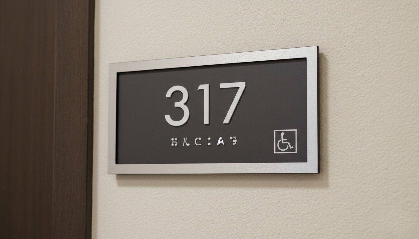
The ADA applies its strictest signage standards to any sign that identifies a permanent room or space. Since a hotel room 101 is not going to pick up and move next week, it is considered a permanent space. Therefore, every single guest room number sign must meet the full set of tactile and visual requirements. This also applies to permanent common spaces like “Restroom,” “Fitness Center,” or “Stairwell.”
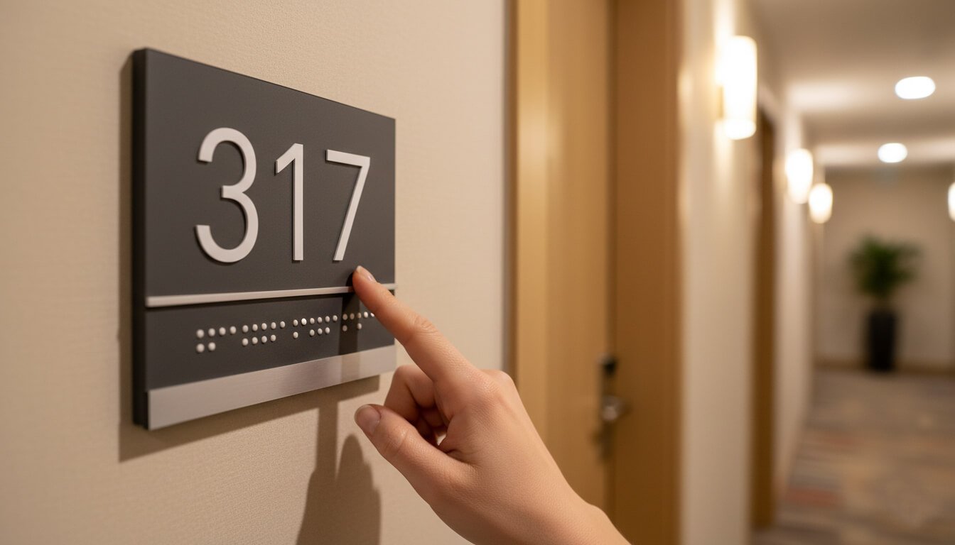
The Anatomy of a Compliant Hotel Room Sign
Creating a compliant sign means designing for two different senses at the same time: sight and touch. Your signs need to be easily readable by someone with low vision from a distance, while simultaneously being readable by someone who is completely blind using their fingertips.
Let’s break down the technical specifications required by the 2010 Standards.
Tactile Elements: Designing for Touch
For guests who are blind or have severe visual impairments, the tactile elements of your sign are their roadmap. These elements must be precise; even small deviations can make them unreadable by touch.
1. Raised Characters
The room numbers or names themselves must be raised from the background surface. This allows them to be felt and traced by a fingertip.
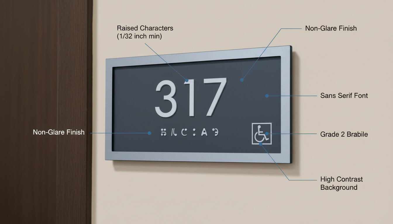
- Depth: The characters must be raised a minimum of 1/32 inch above the background. This might seem small, but it’s distinct enough for tactile reading.
- Case: All characters must be UPPERCASE. Lowercase letters are not permitted for tactile reading because their varied shapes (like the tails on ‘y’ or ‘g’) can be confusing to feel.
- Style: You must use a sans-serif font. These are simple fonts without the small decorative feet at the ends of letter strokes. Think Arial or Helvetica, not Times New Roman. The characters cannot be italic, oblique, script, or highly decorative. Simple is safe.
- Proportions: The letters cannot be too condensed (skinny) or too extended (wide). The ADA has specific ratios for the width of the letter ‘O’ compared to the height of the letter ‘I’ to ensure uniformity.
2. Character Height
Size matters significantly. If letters are too small, they can’t be felt clearly. If they are too big, it takes too long to trace a single letter, making the whole word hard to understand.
- The Rule: Tactile characters must be a minimum of 5/8 inch high and a maximum of 2 inches high, based on the height of the uppercase letter “I”.
3. Character Spacing
If raised letters are pushed too close together, they feel like one undefinable lump. Adequate space between them is vital.
- Minimum Spacing: There must be a minimum of 1/8 inch between the closest points of any two adjacent characters.
- Maximum Spacing: Spacing can generally be up to four times the stroke width of the characters.
Braille Requirements: The Language of Dots
Braille is a separate requirement from the raised tactile letters. You cannot have one without the other; both must be present on a permanent room sign.
1. Grade 2 Braille
You must use Grade 2 Braille (also known as contracted Braille). This is a standard ‘shorthand’ version of Braille used by most proficient readers. It takes up less space and is faster to read than Grade 1, which is letter-for-letter spelling.
2. Braille Position
Braille must be located directly below the corresponding text. If your sign has multiple lines of text, the Braille should be placed below the entire block of text, not interspersed between lines. There must be at least 3/8 inch of clear space between the bottom of the raised text and the top of the Braille dots.
3. Dot Shape
The physical shape of the dots is strictly regulated. They must be domed or rounded. Square or flat-topped dots are often created by cheaper engraving methods, but these are not compliant and feel unpleasant or confusing to the touch.
Visual Elements: Designing for Low Vision
Many guests may not be completely blind but have low vision due to age or medical conditions. For them, visual clarity is paramount.
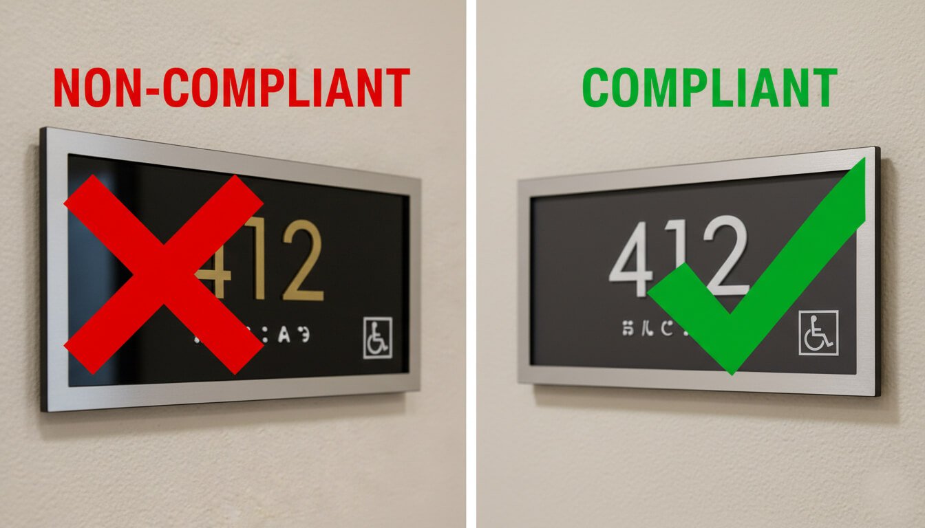
1. High Contrast
The characters on the sign must contrast highly with their background. While the ADA does not specify an exact contrast percentage, the industry standard recommendation is at least 70% contrast. This means light characters on a dark background or dark characters on a light background. Reliable combinations include white on black, dark navy on brushed silver, or cream on dark brown.
2. Non-Glare Finish
Both the characters and the background of the sign must have a matte, eggshell, or other non-glare finish. A sign that reflects overhead hallway lights becomes impossible to read. Avoid polished metals or glossy acrylics unless they have been specifically treated to be matte.
Summary of Key Sign Specifications
| Feature | ADA Requirement |
|---|---|
| Sign Type | Required for all permanent rooms (like guest rooms). |
| Tactile Characters | Must be raised min. 1/32 inch. Uppercase, Sans-Serif font. |
| Character Height | Between 5/8 inch and 2 inches tall. |
| Braille | Grade 2 (contracted), rounded dots, located below text. |
| Finish | Matte, non-glare finish required for background and text. |
| Contrast | High contrast (light on dark or dark on light). |
Installation – Where to Mount Your Signs
You can have perfectly designed signs manufactured, but if your maintenance team installs them incorrectly, your hotel is still non-compliant. Installation rules are designed to ensure signs are always found in a predictable place and are safe to approach.
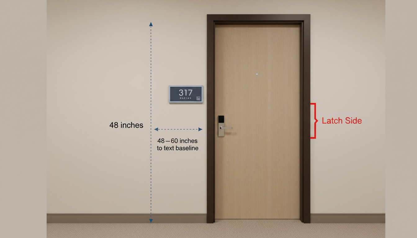
The Latch Side Rule
The golden rule of ADA sign installation is consistency. For room signs, this means they must be mounted on the wall adjacent to the latch side of the door. The latch side is the side with the door handle, where the door opens.
Why? Safety. If a person with a visual impairment is standing close to read a sign with their fingertips, you do not want them to be hit if someone suddenly opens the door from the inside. By placing the sign on the latch side, they are standing safely out of the main arc of the door swing.
Mounting Height
Signs must be placed at a height that is reachable for diverse people, including those standing and those using wheelchairs.
- The Range: The baseline of the lowest tactile character must be at least 48 inches above the finished floor. The baseline of the highest tactile character can be no more than 60 inches above the floor.
- Best Practice: To keep things simple and visually consistent down a long hallway, many installers aim for centering the sign at 54 inches from the floor, which usually keeps standard-sized room number signs safely within the legal range.
Clear Floor Space
A person must be able to get close enough to the sign to read it. The ADA mandates a clear floor space of at least 18 inches by 18 inches centered in front of the sign. This area must be free of obstructions—so don’t place a hallway table, large potted plant, or trash can directly under or in front of the room number sign.
Handling Installation Exceptions
Sometimes, architecture gets in the way. Here is how to handle common tricky situations:
- Not enough wall space on the latch side? If there isn’t enough room on the latch side (perhaps due to a closely adjacent wall), the sign should be placed on the nearest adjacent wall.
- Double doors? If you have double doors with one active leaf (one side that usually opens), place the sign to the right of the active leaf. If both doors are active, place the sign to the right of the right-hand door.
- Inward swinging doors? If a door swings *into* the room (typical for hotel guest rooms), the standard latch-side wall mount applies perfectly.
- Outward swinging doors? If a door swings out into the hallway (less common for guest rooms, more common for electrical closets or stairwells), the sign must be placed on the wall outside of the arc of the door swing so the reader doesn’t get hit.
Materials, Design, and Advanced Considerations
Compliance doesn’t have to mean boring. You don’t have to use standard blue-and-white plastic signs if they don’t match your hotel’s luxury or boutique aesthetic. As long as you meet the tactile, Braille, and contrast rules, you have a lot of creative freedom with materials.
Popular Material Choices
- Acrylic (Plastic): The most common choice. It’s durable, affordable, and can be painted any color to match branding perfectly. Matte-finished acrylic is excellent for meeting non-glare requirements.
- Metals (Aluminum, Brass, Bronze): These offer a high-end look. To ensure they are non-glare, they usually need a specific brushed or matte applied finish. Contrast can be achieved by using dark oxidized text on a lighter metal background.
- Wood & Laminates: These can add warmth to a hotel’s decor. Often, manufacturers will use a wood-look laminate base and apply separate raised acrylic characters on top to ensure compliance while keeping the desired aesthetic.
Smart Signs and Technology
Modern hotels often integrate technology into their room signage. You might see signs with digital “Do Not Disturb” or “Make Up Room” lights. These can be fully ADA compliant as long as the permanent room number portion of the sign still meets all the tactile and visual standards we’ve discussed. The electronic portion should also be designed with high visibility in mind, though it doesn’t typically require tactile elements if it changes state.
The California Difference
If your hotel is in California, you have an extra layer of regulations under Title 24. While this mostly affects restroom signage (requiring two separate signs—one geometric symbol on the door and one tactile sign on the wall), it’s vital to be aware that California often has stricter accessibility standards than the federal baseline. Always check local state codes in addition to federal ADA rules.
The Risks of Getting It Wrong
Ignoring these regulations is a high-stakes gamble. The Department of Justice enforces the ADA, and they take violations seriously. Beyond federal enforcement, the ADA allows private individuals to sue businesses that are not accessible.
Potential Consequences
- Federal Fines: Civil penalties for a first violation can be as high as $75,000. For subsequent violations, this can double to $150,000.
- Litigation Costs: Even if a lawsuit is settled, the legal fees and the cost of urgently retrofitting non-compliant signage can be astronomical.
- Project Delays: If a building inspector spots non-compliant signage during a final walkthrough of a new hotel or renovation, they can withhold the Certificate of Occupancy, delaying your grand opening and costing massive amounts in lost revenue.
Your Procurement Checklist
Whether you are building a new property or renovating an old one, follow this simple checklist when ordering your new room number signs to ensure a smooth process.
- Audit Your Needs: Create a complete list of every permanent room that needs a sign. Don’t forget staff-only permanent rooms like electrical closets or storage rooms—they need compliant signs too!
- Select a Knowledgeable Vendor: Choose a sign fabricator who specifically specializes in ADA signage. They should know these rules better than you do.
- Review Design Proofs Carefully: Do not just look at the colors. Check the proofs for tactile depth, Braille placement, and font choices. Ask your vendor explicitly, “Does this design meet all 2010 ADA standards?”
- Plan the Installation: Before the signs arrive, walk the property. Identify any tricky doors (like those with minimal wall space) and plan where the sign will go.
- Inspect After Install: Once installed, do a final walkthrough with a tape measure. Spot-check mounting heights to ensure your installation team stayed within the 48″-60″ range.
Conclusion: Welcoming Every Guest
ADA compliance for hotel room number signs might seem like a long list of technical rules, but it all adds up to one simple goal: hospitality. By attending to these details, you ensure that every guest, regardless of their physical abilities, can navigate your property with independence and dignity.
Don’t view these signs as just a legal obligation. View them as an essential part of your guest service commitment. When you get it right, you protect your business, enhance your brand, and most importantly, you open your doors truly wide to everyone.
 e.
e.
Frequently Asked Questions (FAQ)